

It’s common knowledge that data is valuable and data analysis can provide significant, often critical, insights for organizations in all fields.So, it is often quite helpful to “consult the data” when making important decisions.
However, and because there are many ways in which data can be misunderstood or used incorrectly (if not deliberately manipulated), data can sometimes fail to reveal important issues or mislead those who would use it as the basis for crucial strategic and tactical decisions.
Here are some of the most common errors / traps I have seen:
Misleading Averages
It is easy and convenient to consider the average when looking at a survey result or other large quantity of data. But that can be deceptive. As my business school finance professor liked to quip, “If you have one foot on a block of ice and one foot in a fire, on average, your feet are warm … but that doesn’t really capture how you are feeling!”
This phenomenon often occurs with data in “clusters.” For example, while working with a client on the development of a medical app, our research uncovered two groups of potential customers: those who indicated a willingness to buy for under $10 per month, and those who were willing to buy at $200. The average preferred price among this population may have been $105, but that price point would not have appealed to either group.
I face another average-related challenge as a part-time faculty member at Boston University. At the end of each course, we survey the students on several factors, using ratings on a five-point scale across a number of elements (e.g., degree of instructor organization, fairness in grading). These ratings are then blended together for an overall average score. The (erroneous) implication imbedded in this calculation is that all elements are of equal importance.
In both of these examples, while the math is simple and the concept of an average is easy to understand, many useful insights are obscured as a result.
Overstating the Magnitude of Change
Years ago, when our kids were young and my family was living in Green Bay, Wisconsin, we frequented a fairground that had a number of older rides. They weren’t great but the tickets were only 10 cents each. At one point, the operators were not making enough money and needed to adjust prices; but they had printed millions of tickets that said “10-cents” on them. So, they did a practical thing: they started requiring two tickets per ride. Still a tremendous bargain, but the local newspaper headlines screamed outrage about how prices had DOUBLED!
Or, consider the example of a hypothetical drug that reduces your risk of contracting a particular disease by 40%. It feels groundbreaking. But if the current risk of that outcome is only 1%, a 40% reduction lowers it to 0.6%. A large relative drop, certainly, but less radical in practical terms.
The point is, when taken out of context, percentage changes can often be misleading.
Combining Results
A common approach in consumer research is to offer a five-point scale as potential responses to a question, with answers ranging from “very unsatisfied” to “very satisfied.” Using what is known as a “top two boxes” approach, the “satisfied” and “very satisfied” response numbers are combined, suggesting the share of customers who are satisfied.
However, these top two groups often feel and act very differently from one another. For example, in a recent HBS study of Starbucks, it was found that the “very satisfied” customers spend over 80% more per year than the merely “satisfied” customers. Here as well, combining data can result in missed insights.
Distorted Data Displays
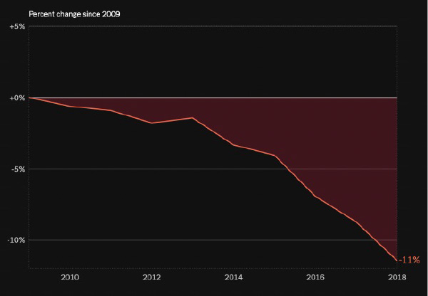
According to a 2019 NY Times article, US high school student participation in football declined by more than ten percent over the years 2009–2018. Is that a big drop off? Well, the graphic below that was included with the article sure makes it look that way.
But now look at the same data on a graph I created using a 100% scale for the Y axis.
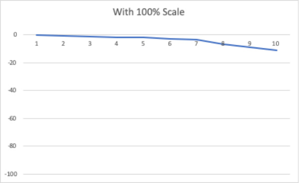
There is still a drop, certainly. But when the full axis is displayed, it looks — and feels — very different. I expect we will see similarly dramatic graphs in the coming months as mortgage interest rates rise and gas prices move up or down!
Reflections
Data and analytics are critically important for many decisions… but it is also important to make sure you understand what the data is really saying.
Be sure you are approaching your analyses — and those of others — with a critical eye, to ensure your decisions are well supported.